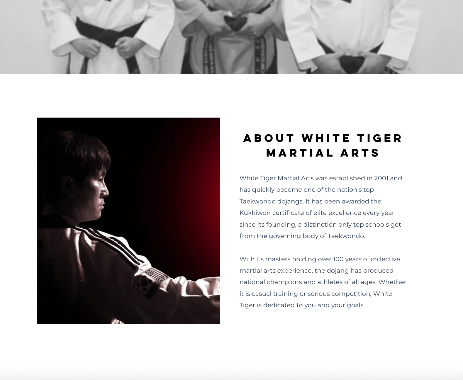
As a national level taekwondo athlete myself, I took on this project understanding the design and martial arts industries. Developing a new visual identity that updated the current visuals and feeling of their studio, and created a more sleek and modern take on a martial art that their clients can better relate to. The gradients implemented take the colors and orientation of the Korean flag and incorporate the colors throughout the new visuals.
roles: identity development, website design, motion graphics, social media graphic design, logo usage, physical design, poster and brochure design, information design
summer 2023 & 2024

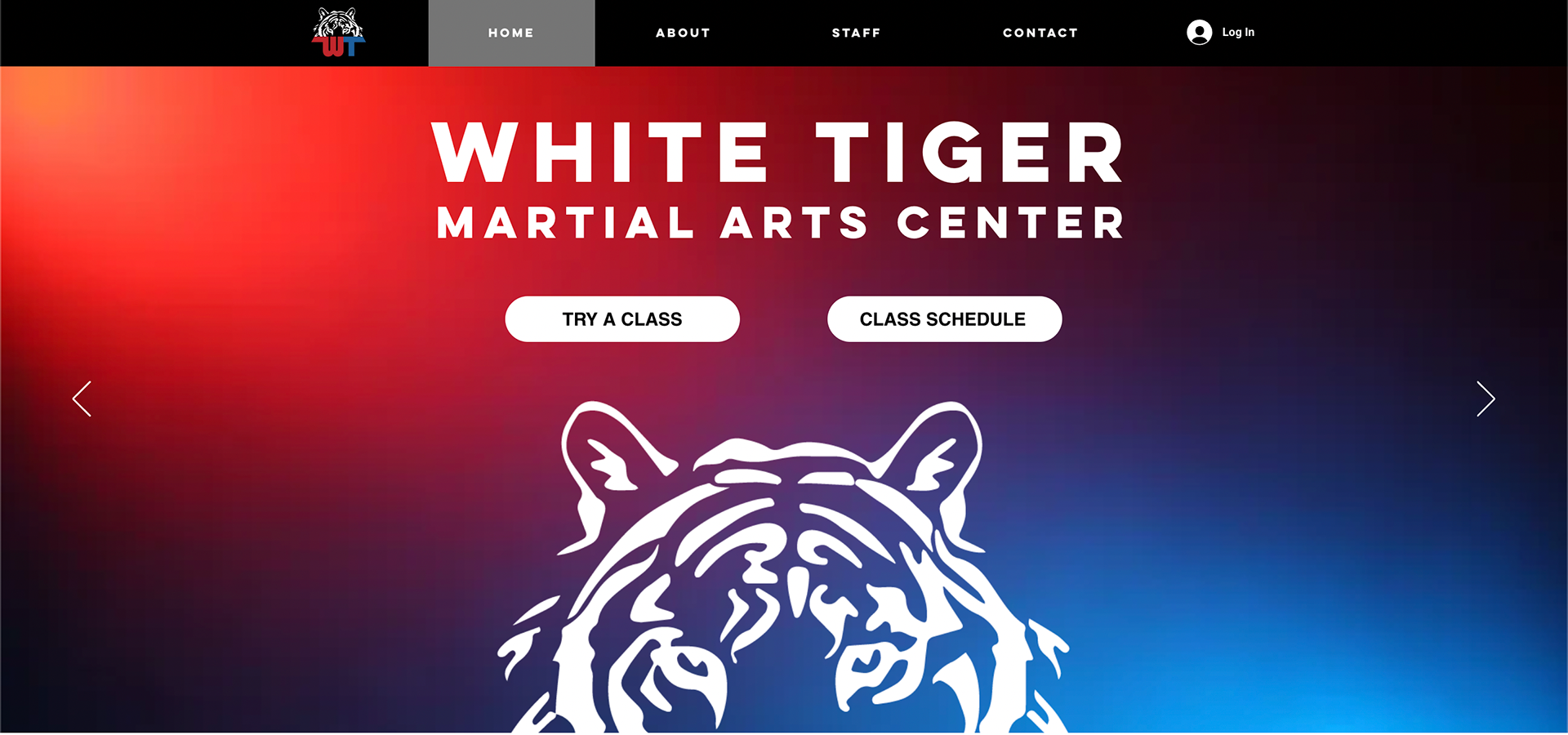
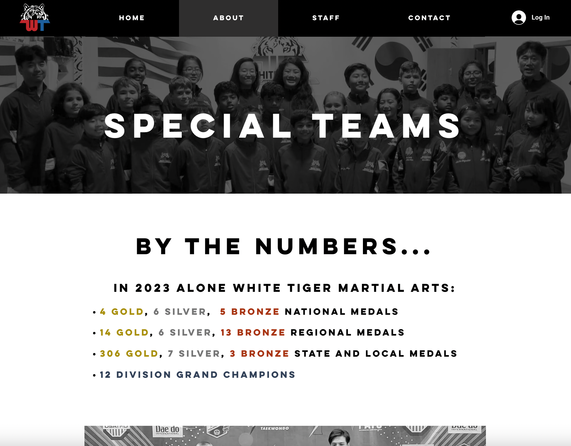
landing page design, format and information layout

designed website scroll

social media asset design

webpage screen grab of gallery page layout

simplified logo rework with branded gradient

new brochures designed with branding, created format, layout, information design, image editing

event poster designed with new branding


medals designed for the White Tiger Tournament

branded border designed